REDUCE STRESS WITH THESE CALMING PAINT COLOURS
The power of colour is a mighty force that should never be underestimated. Research over the decades has proven that it can have a strong impact on your emotions and mental health and even affect physiological responses such as eyestrain.
The shades you surround yourself with can do much more than just refresh a space – they can help to actively reduce stress. Using colour with intention (particularly through the principles of Feng Shui) can be an impactful way of supporting your wellbeing at home. Below, painting and decorating expert Pat Gilham at MyJobQuote.co.uk goes over everything you need to know. Here are some of the top calming paint colours to reduce stress:
Mint
Looking at plants or greenery after a long, stressful day can help you to immediately feel a bit calmer and more relaxed, and the same goes for paint – green shades are undoubtedly one of the best options. This applies to any shade, but mint can be particularly effective.
A mint-painted wall will still bring the fresh and natural feel of any typical green but comes in a much softer and calmer tone. The soft appearance of this pastel colour will work wonders in creating a soothing atmosphere and helping to relieve any tension you may be feeling.
Tea Green
Much like a good cup of tea has been used to relieve stress since ancient times, green tea paint is known for its soothing properties. This shade has a slightly stronger hue compared to mint, so it can be a good choice if you are seeking a calming wall colour that brings a burst of freshness to your home.
In addition to this, with its slight yellow hue, tea green can spark feelings of joy and fun. This is an excellent way to help you forget all of the stresses of the day as you relax and put your feet up in the evening.
Light Blue
Blue is another great soothing wall colour that can go a long way in reducing stress. The tranquillity and airy vibe of this shade will easily make any room feel more comfortable. As with green, almost all shades can work very well, but light blue goes that extra step.
Besides all the general benefits of blue, light blue paint can create a soft and soothing ambience that is essential to help you fall asleep more easily. And we all know that a good night’s sleep is vital in keeping our stress levels down!
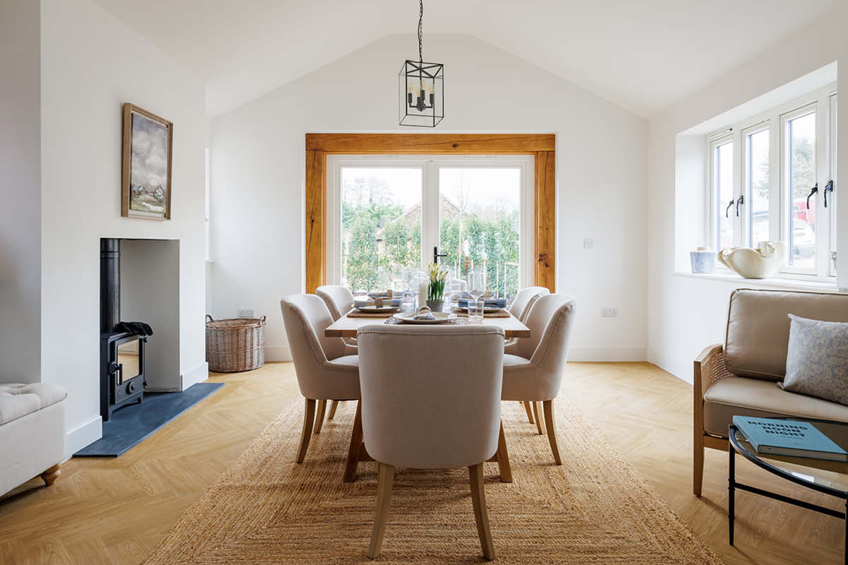
Ivory
Shades like ivory and beige are a timeless classic and perfect for those who prefer a more neutral wall. The aesthetic and eye-pleasing nature of ivory can provide the ideal psychological therapy to refresh our minds and leave us feeling calmer and more grounded.
At first, this calming paint colour will look similar to pure, plain white paint, but ivory provides some warmth that can easily lift up the mood of the entire space. Paired with soft, light wood furniture, you can replicate the vibes of a relaxing coastal retreat.
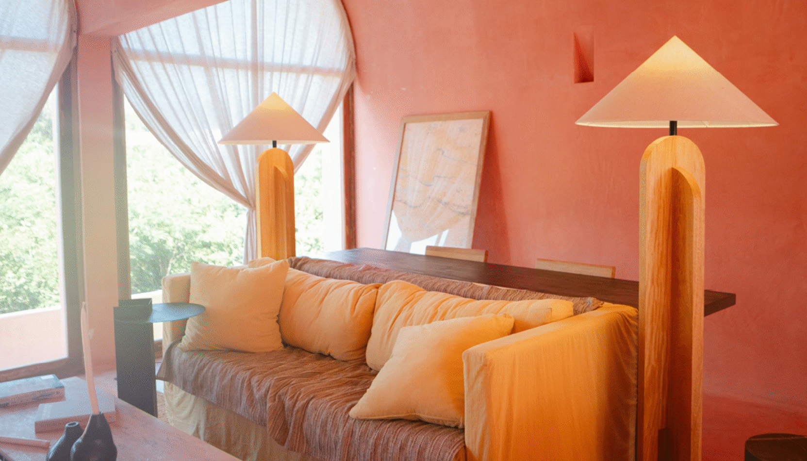
Blush
As a soft and tranquil shade, blush pink or dusty pink can inspire a calming and serene environment, while at the same time looking stunning with its glamorous and luxurious appearance. Paired with light furniture, it is the perfect paint colour for bedrooms or even living rooms.
Shades of pink are a great alternative to red, as they are softer and easier to combine with other colours, as well as spreading harmony and promoting relaxation. If you choose to paint your walls in blush pink, it is a good idea to do it in a room where there is plenty of natural light to make the most of the colour and how it reflects.
Cosy Brown
In Feng Shui, earthy tones such as brown are said to be grounding and stabilising. They help to create a sense of security and support, especially if you are feeling stressed and overwhelmed. Mocha, taupe or warm beige tones work wonderfully in living rooms and bedrooms.
These muted, neutral shades of brown will rid you of all of your anxiety from daily activities and guide you towards a place of calm and happiness. Complement with white or beige furniture to complete the room with a tranquil and stylish look.
Violet
Violet is considered to be the colour of spirituality and wisdom. Bringing together a mix of blue and red, it creates a unique combination that promotes concentration and enhances meditation and self-reflection.
Colours with more of a blue hue tend to be better than darker shades when it comes to relieving stress and creating a calm atmosphere. It is a great idea to use a lighter colour like violet with cool undertones and balance it out using warm-toned decorations throughout the room to create harmony.
Misty Blue
Misty blue is great for those who are seeking a blue-themed interior while at the same time maintaining a sleek, simple appearance. This peaceful wall colour is a unique light grey shade with a hint of blue undertones, combining the neutrality and elegance of the grey with the soft and airy vibe of the blue.
Whilst plain grey walls can be great for calming your mind and relieving stress, this alternative comes with much more richness to liven up your space, leaving your time at home feeling more fulfilling and joyful.
And Finally – What to Avoid
Whilst they can sometimes be beneficial in very small areas, fiery colours such as red, bright orange, or hot pink can cause you to feel angry, agitated and overstimulated. A bright object can draw the eye in a creative space, but avoid using it as wall paint in rooms like bedrooms and living rooms where you are looking to relax.
You should also be mindful of using bold, dark tones in areas of low light. If you are already feeling low or heavy with emotion, dark colours can feel oppressive and make it harder to improve your mood. If you do prefer darker colours, add lightness and softness through cushions, throws, and neutral rugs to balance things out.
MORE ABOUT THE AUTHOR… PAT GILHAM: Pat Gilham has worked as a self-employed painter and decorator for over 20 years and specialises in domestic home decorating projects. He has also worked closely with MyJobQuote over the past 4 years to provide expert commentary and insights, and has been published in a range of leading industry publications and news outlets.